
Poppycock Kombucha
The concept of Poppycock came from my love of fantasy writing and fun healthy beverages. A lot of health food is designed in a simple and sleek way and I sought to make a more unique and fun beverage that good for you.
mood board
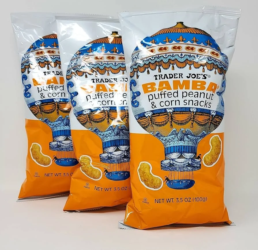
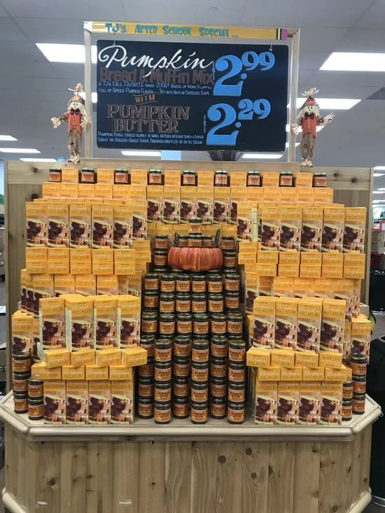
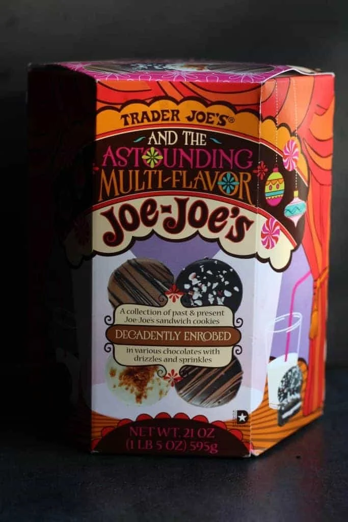
To begin, I had to do market research into who would sell a product like Poppycock and the most likely candidate was Trader Joe’s. Their packaging is fun, vibrant, and bold. Along with that, they’re known for carrying different stock than average grocers and for having a wider range of independent brands on their shelves, so imagining Poppycock as a subset of them fit. This mood board is the main source of inspiration I had in doing the project.


When I started work on the design, I knew I had to maintain the fun feel of Trader Joe’s packaging while still allowing Poppycock to stand out in it’s own way. The font Chaloops was an ideal choice since it’s very readable, came in multiple weights, and matched the aesthetic I was aiming towards. The colors I selected were also very easy, I knew I wanted to have a bold yellow for the logo and pairing it with a vibrant blue gave a nice contrast. The black and white were needed as they were in any project, but the white had a little blue added to blend it in with the pallet.

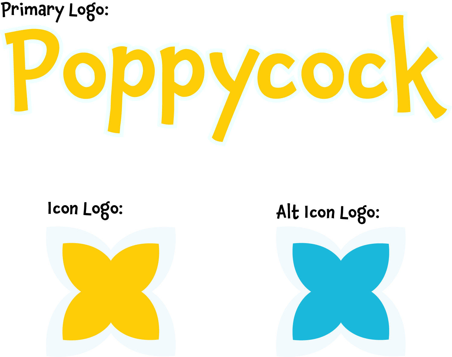
Logo
The logo was the easy part after the mood board. I knew it had to be fun and inviting so having the bold warm yellow was a major luring factor on shelves. As for the icon logo, I wanted to have a simple flower graphic to tie back to the naturalistic and healthy draw of a kombucha and florals are an ideal way to convey that message. By making two versions I had a way to use the icon in various was on different backgrounds and assets as a quick fire way of making the product recognizable.
Packaging
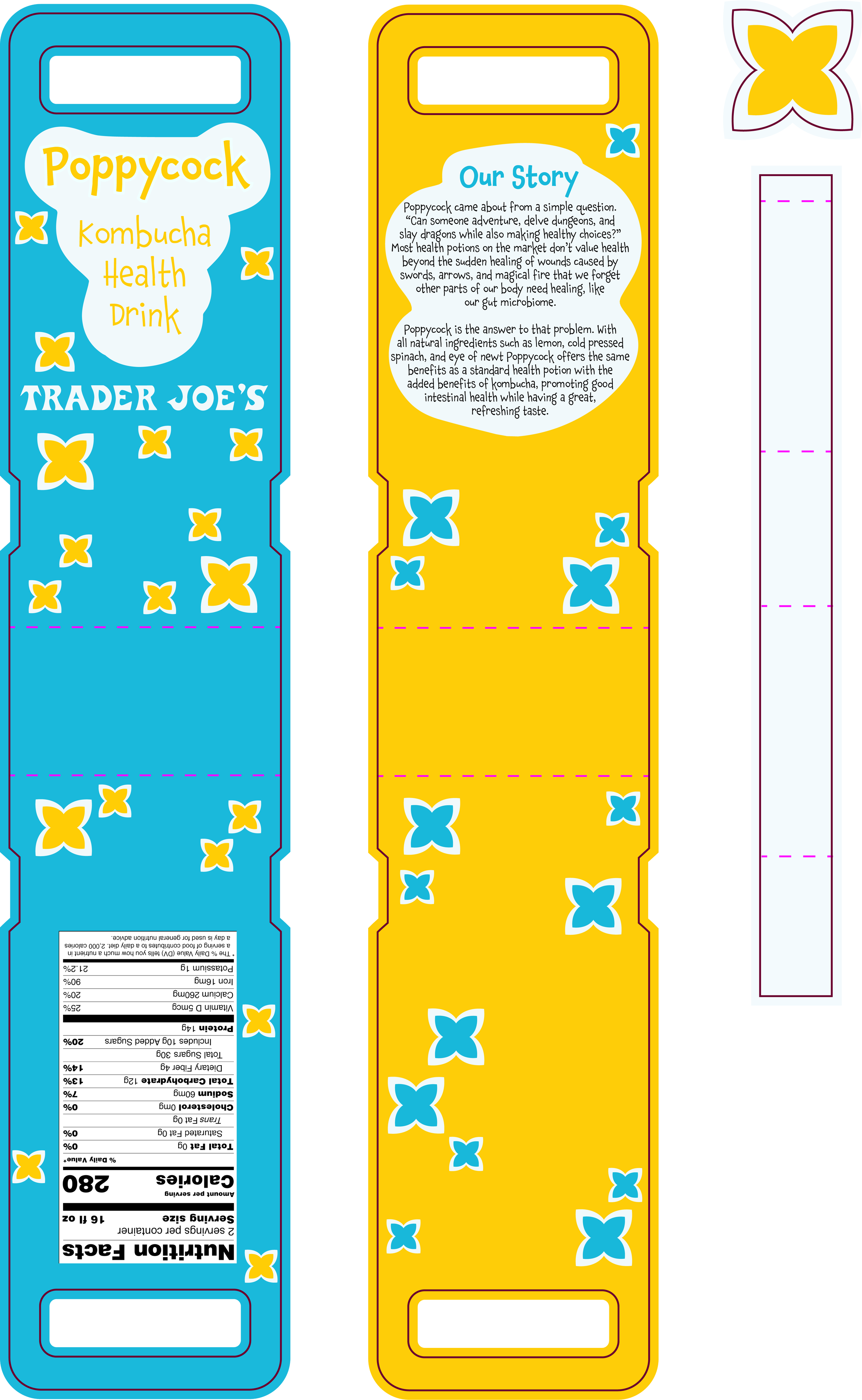
The packaging was my favorite part of the process. I knew from the start the packaging had to be unique and stand out on shelves since Trader Joe’s carries a wide variety of kombuchas, meaning the competition for attention is fierce. I had the idea of making a two pack carrier since it’d be inviting to grab when out with friends, inspired by “little treat” culture that’s prevalent on social media. By having a pack of two it encourages the buyer to share with a friend and try it together. The box folds so the middle becomes the bottom, forming a bag-like shape with the handle at the top and the band and sticker securing it from the sides. Because of it’s welcoming appearance, easy to grab handle, and shareability, it’s the ultimate drink to grab on your way to a day out with a friend.
Final campaign
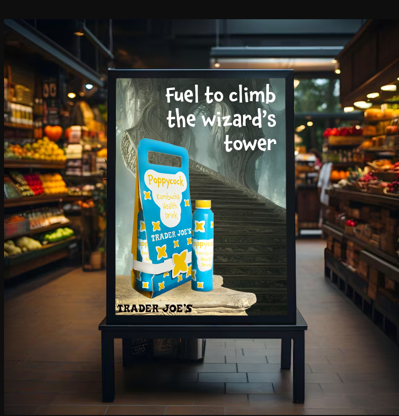
Store Display
The first thing you want to imagine when making a food product is seeing it on the shelves and this is is how I imagine Poppycock would be in stores. The display is clean and sleek with a big sign showing the product from across the store.

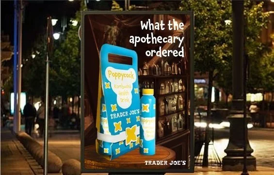
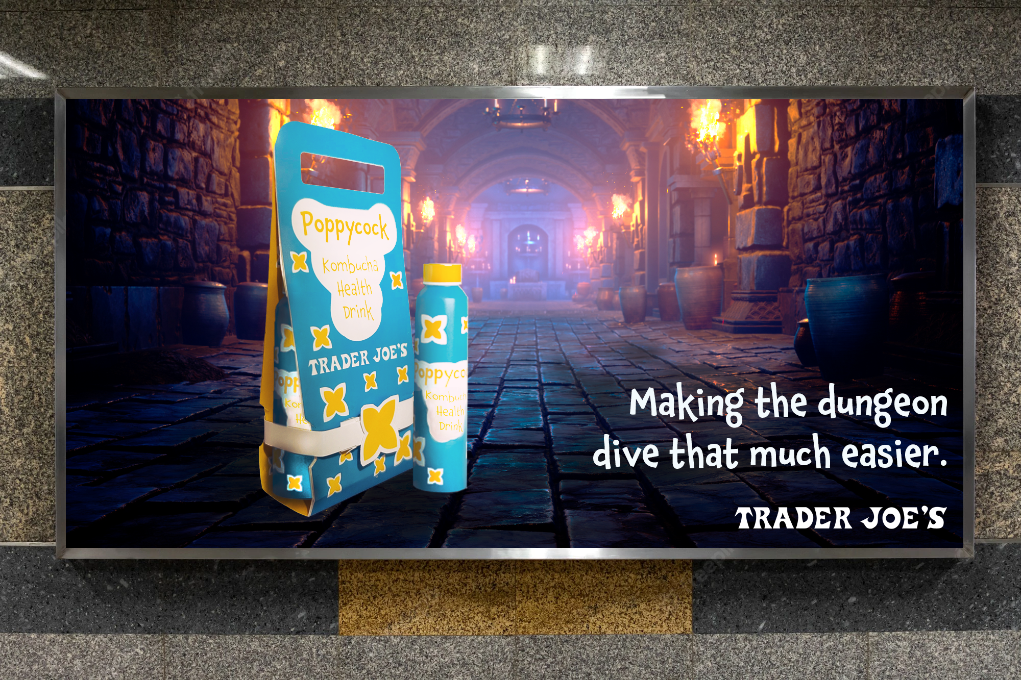
Advertisments
The billboards, posters, and ads were centered around the concepts of gearing up for an adventure and how if you’re going through magic forests or delving ruins, you need the best equipment with you and that equipment can be a little fun.


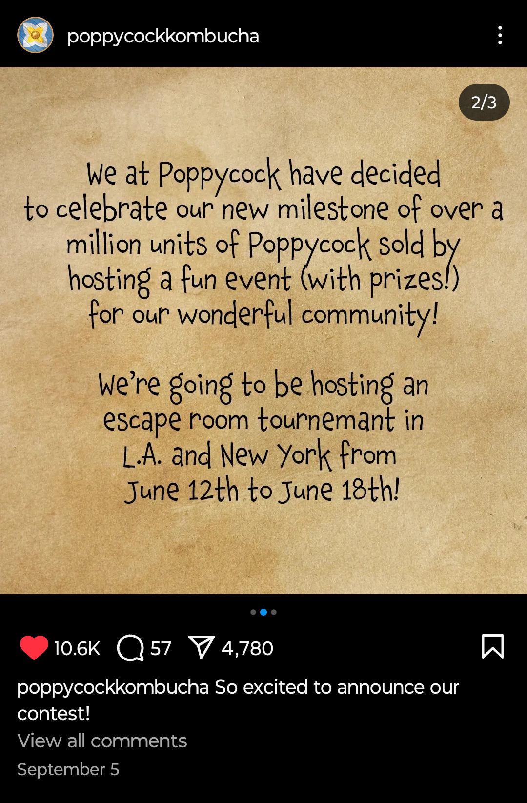
SOCIAL MEDIA
A social media announcement of a fitting milestone campaign for Poppycock. Their posts keep to the fun and whimsical nature of the product’s style while the idea of an escape room tournament suits the demographic of adventure loving puzzle solvers.


MERCHANDISE
Merch is essential to any brand, especially for beverages. The Poppycock merch is simple and sleek with an emphasis on the icon rather than the word itself to keep the look in mind while still repping the brand.


